Site Map

Wireframes:
0.0. Home

0.1. Categories

0.2. Profile

0.3. Portfolio

0.4. Favorite Helpers

0.5. Help

User Scenarios:
G.K.
Alexander

Site Map
Wireframes:
0.0. Home
0.1. Categories
0.2. Profile
0.3. Portfolio
0.4. Favorite Helpers
0.5. Help
User Scenarios:
G.K.
Alexander
PERSONA 2 (IMAGINARY)
Persona Type: Shy, Hard worker
Name: Alexander Locke
Age: 25
Location: Toronto, Ontario
Technical comfort: Fairly comfortable
Job Title: Upcoming cinematographer
Backstory:
Motivations:
Frustrations:
Their ideal experience:
Quote:
“Through this app, I find the other part of me.”
Kirk Villaruz
Prof. Nicholas Stedman
RTA223
Interview Summary:
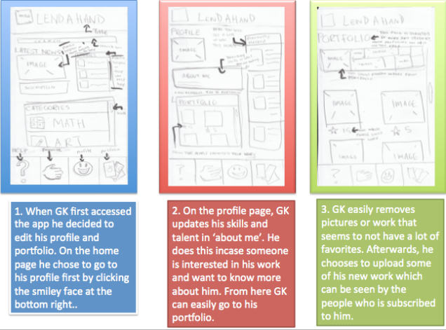
For the interview I had with, GK Villanueva, I feel that it went rather well. He was rather comfortable with the questions I asked, and he responded with great answers. I found it to be ironic how I, the researcher, was more nervous than the person I was interviewing. GK was able to give me answers I wanted but he also made me think about how I can improve my app even more. However, I believe I could have got even better results if it wasn’t for the questions I asked. I feel as though I might have pushed him to answer a certain way and didn’t exactly get to listen to his own opinion. Although, while interviewing him he made me realize how people usually ask only their friends for answers. Even if their friends do not have the answers or the friends decline assistance, they would choose to leave and skip it, rather than doing more, such as asking a professional of that task.
Aside from the interview, while doing more research on making my app better, I stumbled upon a few interesting facts. To be recognized for your work, you should post your information all across popular social networking sites. Much like what I learned in New Media Res Methodologies, by tagging your work and putting it across sites, you will soon gain more and more popularity. Also another interesting fact I learned was the employment rate after graduating university or college. While reading an article on Macleans, it is said how finding jobs may get worse for Ontario graduate students. A quote in the article provides stats on the current situation, “Statcan has already reported that the unemployment rate for 15- to 24-year-olds has reached 16.4 per cent, compared to Ontario’s overall rate of 7.5 per cent”. From looking at this quote, you can notice how this is just the beginning and is highly possible to worsen and provide even more challenge for the Ontario economy.
From gaining all these information from both the interview and research, I was able to come up with ways to make my app better. Beginning with the research information, the article from Macleans made me realize that since college and university graduates are having a hard time finding a job after graduation, my app can provide a section intended for these people. Much like how my app can be used to broadcast your own work, this section will be more towards graduates. Businesses and companies can use this section to easily find people who graduated in programs and their skills can greatly help those in the company. From what I gained from interviewing GK, I should make this app towards people who actually want it and need it. Although it is free for the public to use, I plan to make benefits for those who are actually using the app to become successful or who want to really help those in need. Such as people who want to share their work, by paying a little amount, they can market their work much more than general users. As for those who need help, they can discover skillful individuals who only share their work for paying users.
PERSONA 1
Persona Type: Friendly, Outgoing
Name: Gian Carlo Villanueva
Age: 20
Location: Toronto, Ontario
Technical comfort: Comfortable
Job Title: Works at Holt Renfrew
Backstory:
Motivations:
Frustrations:
Their ideal experience:
Quote:
“It sounds like a good app and will probably help people, but at the same time, it will only help people who actually want it.

By: Kirk Villaruz and Christopher Louie
What Image File Formats should be used for web pages, why (how does compression affect loading?
The best formats that image files should be used for web pages are, JPEG, PNG, BMP, PSD, or GIF.
JPEG: This format is best for photos where you want to keep the file size small, and not bothered to reduce quality in order to make the size small. JPEG however, is not suitable for images with text, large blocks of colour, or simple shapes, because crisp lines will blur and colours can shift.
PNG: PNG is best used for when you want to reduce the size of an image and keep its quality. PNG supports alpha transparency (soft edges) and it was also created to be a Web graphics replacement for GIF.
BMP: This format is used for any type of bitmap or pixel-based images. BMP’s are rather large files, however the quality of the image stays the same.
PSD: PSD is Photoshop’s proprietary format. PSD is mainly used if you are using Photoshop to edit an image and you want to save it with information such as layers. PSD files are usually required to be converted in order for it to be shared with anyone. PSD also comes in two versions, the older version which can be seen by a few programs aside from Photoshop. And the other version, can only be read by Photoshop.
GIF: GID is used for simple Web graphics that have limited colors. GID’s are great for Web buttons, charts or diagrams, cartoon-like drawing, banners, and text headings. GIF’s are also used for small, compact Web animations.
By compressing many of these image formats, it helps speed up your website. The quality of images can heavily impact the performance of your website, that is why by compressing the image quality, it will be easier and faster for viewers to see your website.
Source: http://graphicssoft.about.com/od/graphicformats/f/summary.htm http://www.shallowsky.com/linux/imageformats.html
How do you optimize images for the web?
To optimize images for the web, you have to be sure to compress the image quality. As stated before, there are many image formats available, however there are only a few that work on the web. There are also two kinds of image compression, lossy and lossless. Lossy compression: This means once you decompress the compressed data, you will not get the exact same image as the original. However, this will only be visible at a closer look. Lossy compression is good for web, because images use small amount of memory, but can be sufficiently like the original image.
Lossless compression: When you decompress a lossless image, you will get exactly the same image as the original. This compression uses greater amount of memory, so at times it may not be good for web.
Source: http://inobscuro.com/tutorials/optimizing-images-for-web-35/
What tricks and tips can you use to make your webpage load faster?
1. Optimize the images on your website. For example, use 65% image quality of a jpeg instead of 100%, 2. Try to reduce the amount of frames used within pages. 3. Try to use clean and simple style sheets. If possible, try to use one instead of using multiple style sheets. 4. Minimize external images and items. 5. Use the correct document format for the type of page you are using.
Source: http://www.wikihow.com/Make-Your-Website-Load-Faster
How can you use images in css, show us examples?
You can add images into the HTML coding by using the <img> tag. IMG stands for image, and the tag itself is empty. This means that it does not need a closing tag. To display the image on the page, you need to use both the <img> tag, and the <src> tag. SRC stands for source and you must identify the source of the image before you can place it onto the web page. Here is an example of a HTML link for an image:
<img src=”url” alt=”some_text“>
<img src=”smiley.gif” alt=”Smiley face”>
How To Add a YouTube Video to Your Web Site and video in html5?
The following is the html coding for how to add a YouTube video to your website using HTML5.
To optimize a video for the web you have to make sure it’s in the right format. These are the following formats that should be used: .mpg, .mp4, .mov, .wmv, .asf, .avi, .ra, .ram, .rm or .fly. When incorporating it in your web page, if possible, try to make the video have its own web page or blog post. Also make sure that the title for the video is intriguing and eye catching, so it grab the viewer’s attention and have them watch the clip.
Source: http://www.pr2020.com/blog/optimizing-video-for-your-website
How do you optimize sound for the web and incorporate it in your web page?
There are a few ways to include sound in your webpage. First, however, you should use plug-ins. Plug-ins is a small program which extends the normal functionality of a browser. Plug-ins can be added to an HTML page by either using
Example of using
Another method that is often used is the HTML5 <audio> Element.
The HTML5 <audio> tag defines sound, such as music or other audio streams.
The <audio> element works in all modern browsers.
The following example uses the HTML5 <audio> tag, which specifies one MP3 file (for Internet Explorer, Chrome, Firefox 21+, and Safari), and one OGG file (for older Firefox and Opera). If something fails, it will display a text:
<audio controls>
<source src=”horse.mp3″ type=”audio/mpeg”>
<source src=”horse.ogg” type=”audio/ogg”>
Your browser does not support this audio format.
</audio>
The best solution for HTML audio is to use the HTML5 <audio> element + the element.
Example;
<audio controls>
<source src=”horse.mp3″ type=”audio/mpeg”>
<source src=”horse.ogg” type=”audio/ogg”>
</audio>
This example uses the <audio> element and tries to play the audio either as MP3 or OGG. If that fails, the code “falls back” to try the element.
The only issue with this method is that you must convert the audio files into different formats, and that the element cannot “fall-back” to display an error message.
Source: http://www.w3schools.com/html/html_sounds.asp
What are some of the dos and don’ts of web design with media?
There are many dos and don’ts of web design and the media aspect but the following are just a few that became reoccurring. When thinking of web design, there is no one perfect guideline to follow or dos and don’ts that you must obey. Since each web site you make is specific to the type of website you are trying to build, some aspects might be okay, and some might not. For example, on a website that displays photo galleries, you might not want to design the site in such a way that the images are cluttered close to each other. This draws the views eye away from the actual purpose of the website, which are the pictures. See in this example, a cluttered design is not good, but in a video media sense like YouTube, having a more compact design will allow all content to be viewed. Some other dos and don’ts of web design include: choosing a good domain, planning your website, making it user friendly, use different styles, optimize for the right audience, don’t write bad code, don’t use large images , don’t spam your content, don’t use illegal/copyrighted material, and don’t finish a site. The last one is particularly important to ensuring a long life for your site. If you finish your website, then there is no room to add new content or material for people to view. Eventually your viewers will get tired of the same boring content that exists on the site that they will go elsewhere. This is definitely one don’t that applies to all websites.
Reference: http://smallbusiness.chron.com/top-10-dos-donts-website-building-26605.html
What resolution should you design for?
Of course not all computers have the same resolution, but almost all computers are able to scale down the resolution. This means compacting the design to make it smaller. Therefore it is always better to design your website to the maximum resolution you can because computers can always scale down if it’s too big for their screen. Vice versa, computers are not allowed to scale up, because there is nothing to fill in the remaining space. This will leave your website with a black or white border running the edges and top of their screens. This will show lack of professional design and leave your website looking obsolete compared to other sites. A global screen resolutions consensus was taken from July to November of this year. The most used screen resolution is 1366×768. Therefore website designers have an idea of perhaps which size to design their websites for. But ultimately there are screens bigger than this resolutions so designers should always design to the maximum resolution.
Reference: http://www.hobo-web.co.uk/best-screen-size/
Designing for mobiles?
With mobile devices, designers should follow the same principles as stated above. Mobile screen sizes vary, so designing to the maximum resolution would ensure your content fits every size of mobile screen.

By: Kirk Villaruz and Christopher Louie
1. What Is A Website?
According to www.thefreedictionary.com, a website is defined as:
“A set of interconnected web pages, usually including a homepage, generally located on the same server, and prepared and maintained as a collection of information by a person, group, or organization.”
Basically, a website is a group of web pages, images, videos or other digital information that is put all on one or more Web Servers. A website can be accessed by the Internet, mobile devices, or a LAN.
References:
http://www.whatisawebsite.com/
2. What Is A Webpage?
According to ww.thefreedictionary.com, a website is defined as:
“A document on the World Wide Web, consisting of an HTML file and any related files for scripts and graphics, and often hyperlinked to other documents on the Web.”
A webpage is a web document that is often displayed a monitor or mobile device. Web pages are usually written in HTML, which is to provide hypertext that will navigate to other web pages via links.
References:
http://en.wikipedia.org/wiki/Web_page
3. What coding elements provide a webpage its structure, presentation and behaviour, why is it designed this way?
The strength of CSS lies in the ability to separate content from presentation and allow for more precise control over the layout. With this control, you can change the linear layout of a page without affecting its visual layout, and vice versa. Linear layout refers to the order of elements in the source code of a web page. That is the order in which screen readers users hear the content, and the order in which any user tabs through links and form elements.
Sites created with CSS have more flexibility to adapt to different display devices – not only screen readers, but also mobile devices, small and large monitors, or any other display.
Sites created with CSS are also easier to maintain than sites created with tables: a change to the style sheet is promulgated across all pages at once. This helps maintain accessibility.
References:
http://webaccess.berkeley.edu/developer-information/top-ten-tips/#css
4. What is HTML 5?
HTML 5 is the next evolution of HTML. HTML stands for Hypertext Markup Language, which is the standard programming language for describing the contents and appearance of Web pages. According to an article, this is the plans for HTML 5. In theory, HTML 5 will allow the Web browser to become a development platform.
“A primary goal for HTML 5 is to ensure interoperability among browsers so that Web applications and documents behave the same way no matter which HTML 5-compliant browser is used to access them. (Older browsers that do not support HTML 5 will be able to ignore the new constructs and still produce legible Web page s.)”
References:
http://searchsoa.techtarget.com/definition/HTML-5
5. How do you write an html tag? Why?
There are many different HTML tags that are used for different elements and functions. The key point to make sure when writing html tags is that it is in between < > . This allows the html tag to work. See the link below to see the many different types of html tags:
http://www.web-source.net/html_codes_chart.htm#.UnvGxuIpBFs
6. What is the doctype element used for?
The <!DOCTYPE> declaration is the very first thing in your HTML document, even before the <html> tag. This doctype element is used to declare what kind of HTML is used in the document. “The document type declaration names the document type definition (DTD) in use for the document”. In other words, it is just a code used to tell the browser which version of HTML you are using. Either 3.2, 4.01, 5, or whichever else you are using.
References:
http://www.oreillynet.com/pub/a/javascript/synd/2001/08/28/doctype.html
http://www.w3schools.com/tags/tag_doctype.asp
7. What is an attribute?
HTML elements have attributes that provide additional information about an element. Attributes are always specified in the start tag and come in name/value pairs like: name=’value’. Attribute tags are identified by the <a> tag.
References:
http://www.w3schools.com/html/html_attributes.asp
8. What is a meta tag?
HTML meta tags are officially page data tags that lie between the open and closing head tags in the HTML code of the document. Therefore the meta tags would be located within the middle, or ‘body’ of the html coding. Meta tags are a special html tag that provides information about a web page. It does not affect any way how the web page is displayed, nor will it appear on the screen. These meta tags can be seen within the html coding and can provide additional information such as who created the page, important information, how often it is updated, what the page is about, faqs and read me sections, and even keywords that represent what the webpage is talking about. Many search engines such as Google use these meta tags to display relevant content to what is searched through their engines. In a way, meta tags are how you will tag your information and webpage so that search engines can find your webpage easily.
References:
http://searchenginewatch.com/article/2067564/How-To-Use-HTML-Meta-Tags
http://www.webopedia.com/TERM/M/meta_tag.html
Where do you write text you want to see on the page?
Text on html pages can be written between different tags. Some tags include <head>, <body>, and <title>. If you want to write something, you would write the beginning tag of <title>, type what you want to say, then end it with </title>. To bold a text, you can use the <b> tag. To write text in italics you use the <i>. If you want text to appear underlined, you would use the <u> tag. Remember that after you write what you want, you must close the tag with </write tag here>.
What is the h1 tag used for?
H1 tags are used for headings. They can be written just like any other text. You would start off by writing the h1 tag, followed by what you want to say. Remember that after you write what you want, you must close the tag with </h1>. On every web page, there will be more than one heading. This is why you can use multiple h1 tags. Valid heading tags will range from h1 to h6. It is listen in order of importance, so h1 would be considered the most, and h6 being the least important.
References:
http://www.w3schools.com/tags/tag_hn.asp
How do you load an image on the page?
The following is code for you to load an image onto the page:
<IMG SRC=”image.gif” ALT=”some text” WIDTH=32 HEIGHT=32>
In between the paranthesis would be the file name of the picture you wish to load onto the page. After alt and the = sign, is where you would write a caption describing what the image is, or sourcing where the image was taken from. After you can also determine the width and height of the image.
References:
http://www.htmlgoodies.com/primers/html/article.php/3478181
What is ftp and how do you use it?
FTP stands for file transfer protocol. It is used to simply transfer files between networks or servers on the internet. In order to use it, usually the web page will ask for permission to accept or decline a file transfer. Once it is accepted, you will automatically open an FTP server where the file will be transferred
What is http and how does it work?
HTTP stands for hypertext transfer protocol, and it is an application that uses the web to transfer data. HTTP comprises the rules by which web browsers exchange information. Although most people think of HTTP only in the context of the world wide web, it can be used for other purposes. IT works like a request-response protocol. It requires a request line, an entity, and a server that sends a response back to the computer.
References:
What is a server, a web server?
A server as defined by Google is a computer or computer program which manages access to a centralize resource or service in a network. Also as defined by Google, the term web server can refer to either the hardware or the software that helps to deliver web content that can be accessed through the internet. The most common use of web servers is to host websites, but there are other uses such as gaming, data storage or running enterprise applications.
What is a URL and how does it work?
A URL is an acronym that stands for ‘universal resource locator’. It is basically an IP address that has been converted into words so its simpler to remember the address. This is how the server knows the specific IP location.
How do you create a link?
There are two different tags that are used to create html links. <a> tells us where the link should start, and the </a> tag indicates where the link ends. Therefore everything between these two tags will work as a link. To create a link follow the directions below. First specify where the link is by writing: <a href=. Next insert the URL link in quotations. ( ” “>). Finally add the </a> tag to indicated that the link has ended. Below is an example of how an html link might look in your word text processor.
Click this link to go to youtube: <a href=”http://www.youtube.com”> </a>
References: http://www.echoecho.com/htmllinks01.htm

By: Christopher Louie and Kirk Villaruz
What is CSS and how does it work?
CSS stands for Cascading Style Sheets. CSS is used to help you separate information of a document from the details of how to display it. You use a technique called style to determine the details of how you want to present a document. There are a few reasons on why you separate the style from the content: – To avoid duplication – Maintaining becomes easier – Use the same content with different styles for different purposes.
Through examples, explain how the CSS syntax works:
– A CSS rule has two main parts: a selector, and one or more declarations: – – The selector is normally the HTML element you want to style. – Each declaration consists of a property and a value. – The property is the style attribute you want to change. Each property has a value. Example: p {color:red;text-align:center;}
Through examples, explain the difference between id and class:
The main difference between id and class selectors is that, an id selector specifies a style for a single, unique element, unlike the class selector, which specifies a group of elements and is also the most often used element. Also the id selector uses the id attribute of the HTML element, and is defined with a “#”, and the class selector uses the HTML class attribute, and is defined with a “.
Id selector: #para1 { text-align:center; color:red; }
Class selector: .center {text-align:center;}
Source: https://developer.mozilla.org/en-US/docs/Web/Guide/CSS/Getting_started/Why_use_CSS http://www.w3schools.com/css/css_syntax.asp http://www.w3schools.com/css/css_id_class.asp
Through examples, explain the difference between external style sheet, internal style sheet and inline style, when is it better to use one over the other?
External Style Sheet:
Through an external style sheet, you can change the appearance of a Website by changing one file. External style sheet is best for when the style is applied to many pages.
Example:
<head>
<link rel=”stylesheet” type=”text/css” href=”mystyle.css”>
</head>
Internal Style Sheet:
Internal Style Sheet is best used when a single document has a unique style.
Example:
<head>
<style>
hr {color:sienna;}
p {margin-left:20px;}
body {background-image:url(“images/back40.gif”);}
</style>
</head>
Inline Style:
This method is the least used compared to the other ones previously mentioned. Inline Style Sheets is used sparingly because it mixes content with presentation.
Example:
<p style=”color:sienna;margin-left:20px;”>This is a paragraph.</p>
Through examples, explain the box model
The CSS box model is basically a box that revolves around HTML elements. It consists of: margins, borders, padding, and the actual content.
Example:

Source: https://developer.mozilla.org/en-US/docs/Web/Guide/CSS/Getting_started/Why_use_CSS
http://www.w3schools.com/css/css_syntax.asp
http://www.w3schools.com/css/css_id_class.asp
http://www.w3schools.com/css/css_boxmodel.asp
source: http://www.w3schools.com/css/css_howto.asp
Through examples, explain what floating and position do. What is the difference?
In CSS you can push elements around horizontally to the left or right to create more useful layouts. Floats are often used for images, but it also works well if you want to wrap elements around text. Elements that float next to other elements will not affect it at all. Instead it will simply ‘float’ beside it. An example of the css coding for floating is this:
img
{
float:right;
}
Positioning is similar to floating, but it is designed for you to position the element wherever you want. It can also be placed behind another element. The difference between positioning and floating is that floating is horizontal, and positioning is any location possible.
References:
http://www.w3schools.com/css/css_float.asp
http://www.w3schools.com/css/css_positioning.asp
Through examples, explain css grouping/nesting
CSS grouping and nesting deals with combining similar style sheets/elements with the same properties. Elements will often be grouped for the same style. This type of grouping sector is known as grouping. CSS nesting is given the term for the application of a style for a selector within a selector. In other words, if one style is specific for a group of elements, these elements will be nested together.
References:
http://www.w3schools.com/css/css_grouping_nesting.asp
Through examples, explain how to align elements
CSS positioning properties allow you to position and align an element. Elements can be positioned using the top, bottom, left, and right properties. HTML elements are positioned static by defult. A static element is always positioned accordingly on the page. Here is the coding for fixed positioning:
p.pos_fixed
{
position:fixed;
top:30px;
right:5px;
}
This method is usually the most common alignment. This positioning allows the element to be positioned within the page margins. You can also align elements so that they overlap with one another. The following is the code for that positioning:
img
{
position:absolute;
left:0px;
top:0px;
z-index:-1;
}
Reference: http://www.w3schools.com/css/css_positioning.asp
Through examples, explain how to build a css navigation bar
Navigation bars are easy to use menus for any website. CSS can transform regular HTML menus into better looking navigation bars. Essentially the navigation bar is a list of links set across horizontally on the top of the web page. Another word for this bar is called a menu bar, and is essentially used to help the user navigate the website to what they are looking for. Below is the coding to building a css navigation bar:
<ul>
<li><a href=”default.asp”>Home</a></li>
<li><a href=”news.asp”>News</a></li>
<li><a href=”contact.asp”>Contact</a></li>
<li><a href=”about.asp”>About</a></li>
</ul>
Reference: http://www.w3schools.com/css/css_navbar.asp
Through examples, explain how to build a css based image gallery
Let’s get started with placing the images on the screen. This will be done simply by floating the images to the left. There will be four rows that contain four pictures each and will be set at 25% height and width. The borders are placed in a container through box-sizing.
a {
float: left;
width: 25%;
height: 25%;
position: relative;
border: 1px solid #333;
-moz-box-sizing: border-box;
-webkit-box-sizing: border-box;
box-sizing: border-box;
}
Next, it’s time to set the image sizes to 100% with an absolute position and transition. You’ll notice that in the first variant of the demo, that the images appear greyed out. That is done through opacity, which is also a part of this code.
a img{
display: block;
width: 100%;
height: 100%;
-webkit-transition-property: width, height; /* we specify, what properties we need to change*/
-webkit-transition-duration: 300ms; /* we specify, with what speed it is necessary to return an image in its initial look*/
-moz-transition-property: width, height;
-moz-transition-duration: 300ms;
-o-transition-property: width, height;
-o-transition-duration: 300ms;
position: absolute;
opacity: 0.3; /* add opacity*/
cursor: pointer;
}
To provide a caption to the photos, you can use a pseudo element: after. The caption appears in the bottom right corner of each image. It should be obvious that you can update the content element to your own copyright or caption information.
a:after {
display: block;
position: absolute;
width: 100%;
height: 100%;
content: “Studio.com”;
color: #eaeaea;
font-family: “Trebuchet MS”;
font-size: 16px;
opacity: 0.5;
}
Using the pseudoclass: focus, you can create the appearance of the image opening and enlarging. This only works with form fields and links, so an a tag is used. Because pseudoclass: focus does not currently work well in Chrome, the alternate solution is to add the index element to the link.
a:focus img{
width: 250%; /* we increased an image to this size */
height: 250%;
position: absolute;
opacity: 1; /* transparency is not needed */
z-index: 1; /* for a photo to enlarge over all images */
-moz-box-shadow: 0 0 15px 2px #000;
-webkit-box-shadow: 0 0 15px 2px #000;
box-shadow: 0 0 15px 2px #000; /* we add some beauty */
-webkit-transition-property: width, height; /* we decrease the image */
-webkit-transition-duration: 2s; /* we specify, with what speed it is necessary to increase an image */
-webkit-transition-delay: 0.3s; /* as a browser will process it, before enlarging a photo */
-moz-transition-property: width, height;
-moz-transition-duration: 2s;
-moz-transition-delay: 0.3s;
-o-transition-property:width, height;
-o-transition-duration: 2s;
-o-transition-delay: 0.3s;
cursor: default;
}
At this point, you should have a working gallery in terms of the CSS3 set up. However, at this point, all of your images will enlarge from the upper left corner to the lower right. This is corrected by using a pseudoclass nth child. This will change the behavior of where the image appears to enlarge from depending on where the image is positioned.
a:nth-child(4n+4) img, a:nth-child(4n+3) img{
right: 0;
} /* every fourth element starting with 3rd and 4th will be enlarged from the right border of browser window */
a:nth-child(n+9) img{
bottom: 0;
} /* all elements, starting with the ninth will begin to enlarge upwards */
Now to address how to close the images after they have been enlarged. The images are opened through focus and you can close them in the same manner. From the user perspective, the images will be closed by pressing an X (or by simply clicking on another image). Here’s some sample code on how to create the X, which is really a + rotated by 45 degrees.
-webkit-text-shadow: 0px 0px 5px #222;
-moz-text-shadow: 0px 0px 5px #222;
text-shadow: 0px 0px 5px #222;
-moz-transform: rotate(45deg);
-o-transform: rotate(45deg);
-webkit-transform: rotate(45deg);
cursor: pointer;
To finish, here’s the code for closing an image after it has been enlarged:
.closed{
display: none;
}
a:focus~.closed{
display: block;
}
This will also cause the X to close as well. Good luck with this sample code and hopefully you’ll be on your way to creating a CSS3 image gallery.
References: http://www.htmlgoodies.com/html5/css/how-to-create-a-css3-based-image-gallery.html#fbid=N0XuGyzcCRo

Week 4:
Web 3.0 – Sam Legros
Before being part of the new media program at Ryerson, I was never aware of the evolution of the Internet. There were many words and information I never knew about, such as the first World Wide Web was called Web 1.0. Sam Legros’ presentation was really great as it helped me learn new information about the development of the Internet. His presentation helped me know the difference between the Internet and web. The Internet is a network of computers and the web is an access to information using the Internet as the medium. I also gained a better understanding about Web 1.0, 2.0, and 3.0. These evolutions are not considered to be a technological change, but rather a social and cultural change. When the first World Wide Web came about, society chose to name it Web 1.0. Web 1.0 is basically static, company based, and no external editing. Web 2.0 started once the internet became popular due to sites such as Google, Youtube, and Facebook, being created. People became greatly interested with these sites as they could access information with other people around the world. Web 3.0 is the latest evolution and it is about how external sources gather information and creates new data. Web 3.0 started also because of social networks, mobile technologies, and user participation. Though there are democratic possibilities for creators, there is also an increase of private information being exploited. I was so intrigued by this presentation that afterwards, I was pondering on the future development of the Internet. Just how far can the Internet evolve, and what can be created that can surpass what is already on the Internet?
source: http://prezi.com/gplpio5fiurw/web-30/?utm_campaign=share&utm_medium=copy
Week 5:
Ethnography – Rebecca
This presentation was very well done. I feel as though I learned a lot about what is Ethnography. I was quite surprised that even though I have never heard this term before, I had experienced it a few times in my life. So from the information I obtained, ethnography means a portrait of people, and as a viewer, you are writing and observing how people interact in different cultures. You also see how a culture works together, and if they receive any struggles performing a task. One example of this is researchers who go into different cultures to study several aspects of sociological behavior. By putting people together, you observe how people react with a machine, and how a machine may confuse them. Rebecca also showed a video that was rather amusing as it perfectly shows what goes on with ethnography. Two people were in a room trying to figure out how to operate a machine. They believed it to be a complicated piece of technology, but it turned out to just be a photocopier. The most amusing part was finding out that both of them were award-winning scientists. As you can tell, ethnography is really important in our daily lives since it is basically finding out the understanding of everything. This is especially more important for product makers as it is a great technique that can help you see how one may behave around a certain product.
Week 6:
Data Visualization – Carlos Sabbah
One of the presentations that were shown in class was about Data Visualization. The presenter, Carlos Sabbah, explained how it is the study of the visual representation of data. He also explains that the author of the article he chose defines data visualization as a dynamic discipline in order to quickly react to new developments in graphics hardware. From this presentation I feel as though I gained more knowledge on what is data visualization and its purposes. For example, some goals that data visualization is trying to achieve are to provide information clearly by graphical means, and to also convey ideas effectively, and both aesthetic form and functionality need to go hand in hand. The presentation provided an example of a good data visualization. Akami Network Performance Comparison was shown, and it shows the packet loss and network speeds between different cities around the world. This is a good example because it shows what it entails. An example of a bad visualization was also presented. A graph was shown but it was unclear on what is going on. This is why it was an example of a bad data visualization because it does not hold meaning or does not to a good job at presenting it. It also provided no titles, bad labeling, and no point to prove. From this presentation I got a better insight on what is data visualization and how to avoid creating a bad one and how to make a proper and affective data visualization.
Week 7:
Open culture – Jo Elle
For one of this week’s presentation, we learned about open culture. From the information I got from the presentation, open culture is defined as a concept where knowledge should be spread freely. One example of this would be an open source, such as Wikipedia and Flickr. Wikipedia is an online encyclopedia that can be altered or modified by any user, and Flickr is an online community where everyone can share photos on the Internet. This presentation also describes what freely means. It basically means open, so when a source is free, it is open and can be adapted and changed. Open culture can have some major benefits; such as making it easier to share knowledge online, as well as it creates a form of communication.
Week 8:
Hacking Culture – Dimitri
I really enjoyed this presentation. Hackers have always been an interest to me and through this presentation I was able to learn more about them. According to Dimitri, “The hacker explores the intersection of art and science in an insatiable quest to understand and shape the world around him.” After explaining what it is, he explained where the history of hackers started. He said that the MIT artificial Intelligence laboratory, the University of California, Bereleye and Carnegie Mellon University are well-known hotbeds of early hack culture. Hackers are usually known for creating software and sharing it with each other, placing a high value on freedom of inquiry, an emphasis on rationality, distaste for authority and a playful cleverness, and taking the serious humorously and their humor seriously. Many hackers are seen as criminals due to their work, however they don’t want to cause trouble. They usually hack systems for the pure challenge or to learn how a system works. Criminal types of hackers are called Crackers. Crackers are illegal hackers and they perform unauthorized remote computer break-ins. These types of hackers are considered as Black Hats. Aside from Black Hats, there are two others, White Hats, who try to do good, and Grey Hats, who are in between and they get paid to achieve information. Dimitri’s presentation was really enjoyable and my knowledge about hackers has definitely increased.
Week 9:
Virtual Worlds – Blaze Box
A virtual world is defined as an online community. In it, people, places, experiences, and online environments, have game like immersion and social media functionality. A virtual world makes you feel like you’re with people in the same place together. An example of one is Second Life. In this virtual world, you can create someone for fun or someone you choose to be. Virtual worlds became recognized in the 1970’s and 1980’s, and the first graphical social virtual world is Habitat (Morningstar & Gamer, 1991). The main function for Virtual Worlds is the creation of meaning through the manipulation of the world and communication with others within the world. In just 4 years, it has evolved greatly. One example is Online Traveller, which lip-synced voices for interaction. This experience seemed as though the avatars are actually talking. Most people use virtual worlds for different reasons. Some use it as business opportunities, some just for pure enjoyment, and others for social interactions.
Week 10:
Artificial Intelligence – Christopher Louie
Artificial intelligence is “the theory and development of computer systems able to perform tasks normally requiring human intelligence, such as visual perception, speech recognition, decision-making, and translation between languages”. There are many different forms of real-world applications of artificial intelligence that include video games, siri, gps, and cleverbot. In 1972, the first computer chess game was created and the AI machine beat a human. The next milestone for AI was when it beat contestants on Jeopardy. Soon AI was taking over millions of jobs because forms of artificial intelligence that was much more efficient and effective than humans started replacing millions of jobs. Millions of people lost their jobs, and this is what is feared for the future. Questions arose such as “Will robots steal our jobs?” and “Machines will be capable of doing any work a man can do”.
Week 11:
Interactive Art – Lou Lou
Interactive art is a form of art that involves the spectator in a way that allows the viewer to achieve its purpose. It began to provoke the art world in the 1960’s and 1970’s. Interactive art uses software applications called ‘agents’ that allows for the interaction to occur. Interactive art is also split into categories. First is static, which means that the art object does not change and is viewed by a person. Second is dynamic passion, which means that the art object has an internal mechanism that enables it to change or it may be changed by the environment. There is also dynamic interactive which is varying. It means that the conditions for both dynamic passive and dynamic interactive apply. In this presentation, they used Beta_Space as an example of interactive art. It is an interactive research space at the powerhouse Museum in Sydney Australia. Interactive art can be related to new media because it engages viewer participation, creates an experience through the artwork, and the viewer becomes part of the piece.
Week 12:
Cyborgs – Justice Walz
As technology keeps on evolving it is also becoming part of us. Not only metaphorical, but also so physical. In popular culture, cyborgs are often seen as half-man and half-machine. And at often times they are misinterpreted to be androids. In real life there have been many instances of cyborgs. For example, the first official cyborg is Kevin Warwick. He installed a microchip to his arm, and he was able to remotely control objects in his household. Warwick realized video and technology advancing, but humans stay the same. Therefore, he used himself as a guinea pig, and went past what is considered the human rate. His achievement inspired many people. One of Kevin’s students added magnetism to his fingers. This increased his sense of touch. The use of cyborg technology can be used for many things. For one, it can be used to rehabilitate amputees. An example is, Jesse Sullivan. He lost his arm, but got amputated with a robotic one. Second it can be used to supplement vision. Neil Harbisson can be seen as an example because he could only see in gray scale, but with an invention he created, he was able to see colour through sound. Cyborg technology became an extension of who he was. The possibilities for this type of technology are great. Perhaps in the future, you can build a camera with zoom lens into our eyes, allowing magnification of distant scenes or vision through infrared for nigh vision. However, with many great things there could also be major negatives. Some examples of the controversy about cyborg technology are that it could be a potential invasion of privacy, or RFID could be used to tracking humans and animals, or that the utilization of insects and animals in the military for tactical combat purposes. This raises the question of “Where do you draw the line for how far can you go for what you create?”

MLA Styles:
By Kirk Villaruz and Christopher Louie
1- How do you cite a book in MLA styles? write an example.
In most cases, a book would be written by one author. In this instance the following format is used for citing a book in MLA style:
Format:
Author Lastname, Firstname. Title of Book. Place of Publication: Publisher, Year. Medium.
Some key points to make sure in your citation is that the Last name comes first, and then the first name of the author. Another key point to point out is that the title of the book should be italicized.
Example:
Grenfell, Wilfred Thomason. Adrift on an Ice Pan. St. John’s: Creative, 1992. Print.
In situations where there is more than one author, follow the same format except include other authors. Remember to put the most significant author first, and always place the surname before the first name.
2- How do you cite an article in MLA styles? write an example.
There are many different types of articles that you can site such as newspaper articles, journals, and online articles from websites. Each of these citations follow the same basic format, with slight variations with each.
Format for a printed journal article:
Author Lastname, Firstname. “Title of Article.” Name of Journal Volume. Issue (Year): Pages. Medium.
Example:
Cox, Gordon. “A Newfoundland Christmas Caroling Tradition.” Folk Music Journal 3.3 (1977): 242-60. Print
Format for newspaper article:
Author. “Title of Article.” Name of Newspaper Day Mon. Year: Pages. Medium.
Example:
Hudson, Catherine. “Sunken Boat Discovered in Deer Lake.” Western Star [Corner Brook] 16 Oct. 2009: 3. Print.
Format for web article/magazine:
Author. “Title of Article.” Name of Magazine. Name of Publisher, Day Mon. Year: Pages. Medium. Date you accessed it.
Example:
Moher, Frank. “Son of the Rock.” Backofthebook.ca: Canada’s Online Magazine. Single Lane Media, 11 Oct 2008: n.pag.
Web. 14 Jan. 2009.
As you can see, all 3 formats have the author first, then the title of the article proceeding. The only changes in the 3 different formats is the medium in which they are written in. These will vary from ‘print’, and ‘media’.
3- How do you cite a blog or website using MLA styles?
Citing websites is probably the most common form of citations people do because most resources being accessed are online. You can cite an entire website, or webpage, or even a particular line or paragraph.
Format:
Author Lastname, Firstname (if available). Name of Site. Name of institution/organization affiliated with site (sponsor or publisher), date site was created (if available). Medium. Date you accessed it.
Example:
Folk Arts Society: Living our Traditions. The Folk Arts Society, n.d. Web. 27 Sept. 2010.
4- How do you cite a video in MLA styles?
What is usually contained when citing a video is, the title, the director, the distributor, year of release, and medium. It is also possible to include the names of the writer(s), performer(s), and the producer(s), also the date of the video’s original release. The structure would look like this: Film title. Dir. First Name Last Name. Distributor, Year of Release. Medium. To begin the citation, you first have to include the title of the film but italicized and then a period placed after the name. Next, you would input the director’s name, and the abbreviation “Dir.” should be place before his name. You may also include the writers, performers, and producers, with the abbreviation “Prod.” placed before their names. Afterwards list the distributor of the film, then a comma, and the year the video was originally released. Finally, you with conclude the citation with the medium on which you watched the video, such as film, DVD, VHS, and laser disc. Example: Jacob’s Ladder. Dir. Adrian Lyne. Perf. Tim Robbins, Elizabeth Peña, and Danny Aiello. TriStar Pictures, 1990. DVD. Reference: “How to cite a film in a bibliography using MLA.” bibme. N.p.. Web. 7 Nov 2013. <http://www.bibme.org/citation-guide/MLA/film>.
5) How do you cite a lecture in MLA styles?
For most citations of a lecture, it would contain the speakers name, title of presentation, event or meeting name, the venue, city, the date the lecture took place, and the lecture type. The structure would look like this: Last Name, First Name. “Presentation Title.” Meeting/Event. Venue, City. Date Conducted. Lecture Type. In the beginning of the citation you would first present the name of the speaker, however starting with the last name first, then the first name followed by a period. Afterwards, if there was a title for the lecture you would place it next to the name in quotation marks, and a period after it. Then you would place the meeting place where the lecture took place in then a period. If there was also an institution that helped sponsor the lecture, place it after the information on meeting. Next to this, you would include the venue name and the city this lecture took place in, and you would separate the venue and city with a comma. Then state the date of the lecture, and the date should be written in the international format. Lastly, you would end the citation with the lecture type, such as reading, lecture, and address. Example: Pausch, Randy. “Really Achieving Your Childhood Dreams.” Journeys. Carnegie Mellon University. McConomy Auditorium, Pittsburgh. 18 Sept. 2007. Lecture. Reference: “How to cite a lecture in a bibliography using MLA.”bibme. N.p.. Web. 7 Nov 2013. <http://www.bibme.org/citation-guide/MLA/lecture>.
Bibliography:
How to cite films in MLA bibliographies – Works Cited Style Guide – BibMe
 kirkvillaruz